Frontend Tutorial
The Masterful GUI provides visual explanations of how Masterful’s regularization and optimization techniques are applied to your model and data. It also includes visualizations and analysis of your model and data.
Getting Started
Masterful’s GUI is installed as a pip package and is tested on Ubuntu, MacOS, and Windows. The frontend works on both active training runs and already completed runs.
Installing the masterful pip package will automatically install the masterful-gui package as a dependency:
$ pip install masterful
Then when the package is installed, run the following command to run the GUI:
$ masterful-gui
The command will run the GUI server locally on port 7007, and you can access the GUI via a web browser by going to the URL:
http://127.0.0.1:7007/
Remote Instance Support
You can use port forwarding to access the GUI remotely. For example you may be running masterful-gui on an instance in the cloud, and access it via your local machine’s browser.
To do so, first install and run the GUI on the remote instance, then on your local machine run:
ssh -NL 7007:localhost:7007 <remote_hostname>
Note: Remote instances that are hosted on cloud service providers might require additional flags. For example, to enable port forwarding with a remote instance hosted on AWS, the command above would look like:
ssh -i “<key_name.pem>” -NL 7007:localhost:7007 <username>@<public_ip>

ssh -i "john_smith.pem” -NL 7007:localhost:7007 ubuntu@123.1.2.3
After enabling port forwarding successfully, using a web browser on your local machine go to the URL:
http://localhost:7007/
Note: Please note that the GUI will show the data stored on the machine where the GUI is running, not where it’s accessed. If the GUI is installed on both the remote instance and the local machine, only the data on the remote instance will be displayed. To access the data produced from runs on your local machine, run the GUI locally.
Using the App
The Masterful GUI provides visual explanations of how Masterful’s regularization and optimization techniques are applied to your model and data. It also includes visualizations and analysis of your model and data. Each training run done with Masterful will be shown in the GUI, allowing you to analyse the results of the run.
Training Runs
This page displays information on your regularization parameters and model improvement. The information is organized as a table with all the training runs done with Masterful. Visualizations include a parallel coordinates plot to visualize the regularization params search process, as well as model improvement on loss, error rate, recall, and precision. Each visualization has a dedicated section in this documentation with details on how to interpret their values and meaning.
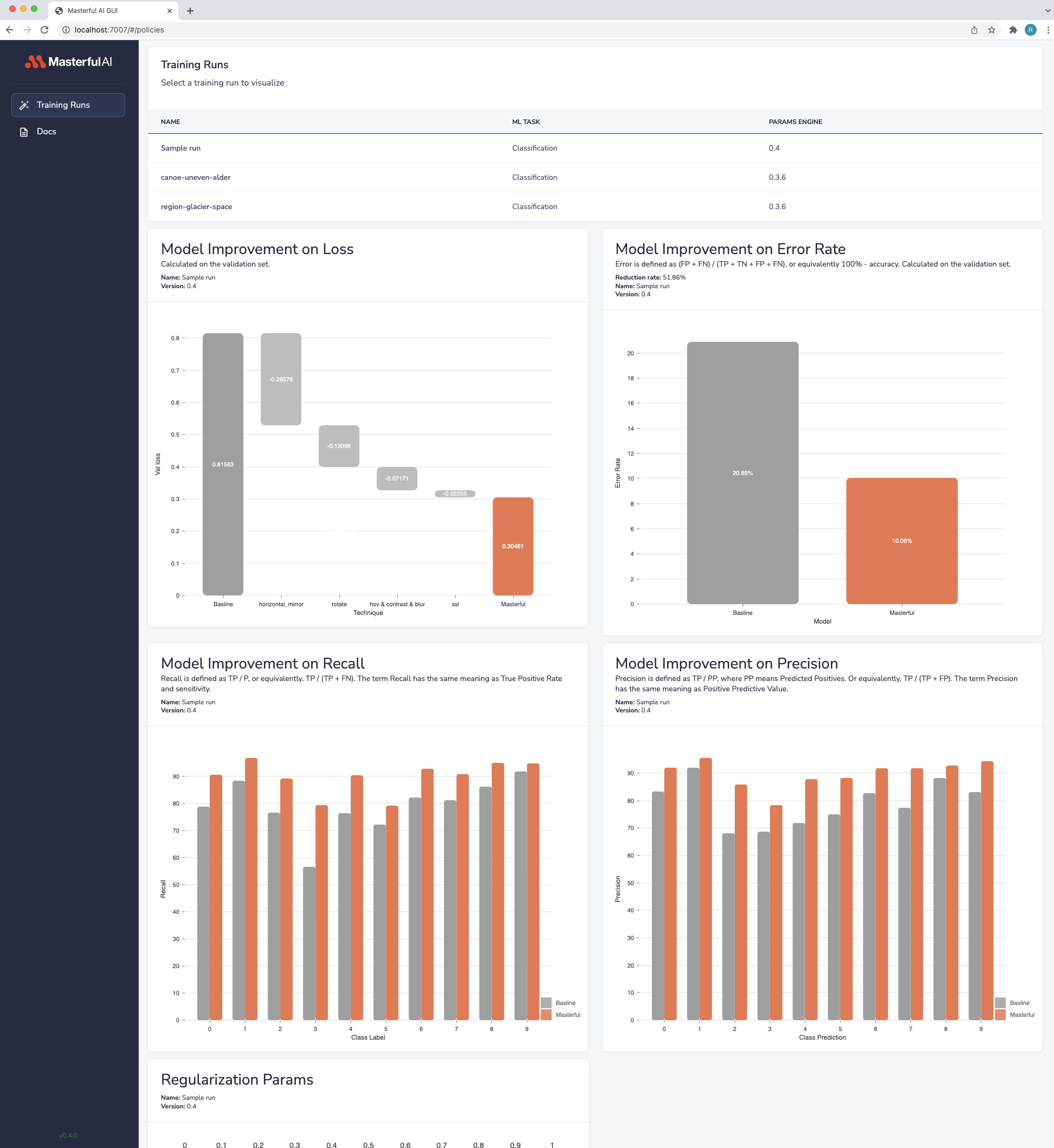
Searching For Optimal Regularization Params & Parallel Coordinates
A parallel coordinates plot describes the optimal regularization params search process performed by the Masterful training Platform. This plot includes both the optimal params as well as other params searched. In the plot, each horizontal axis represents either a single technique or a cluster of techniques that are included in the params. The search algorithm behind the clustering is not visualized on this plot.
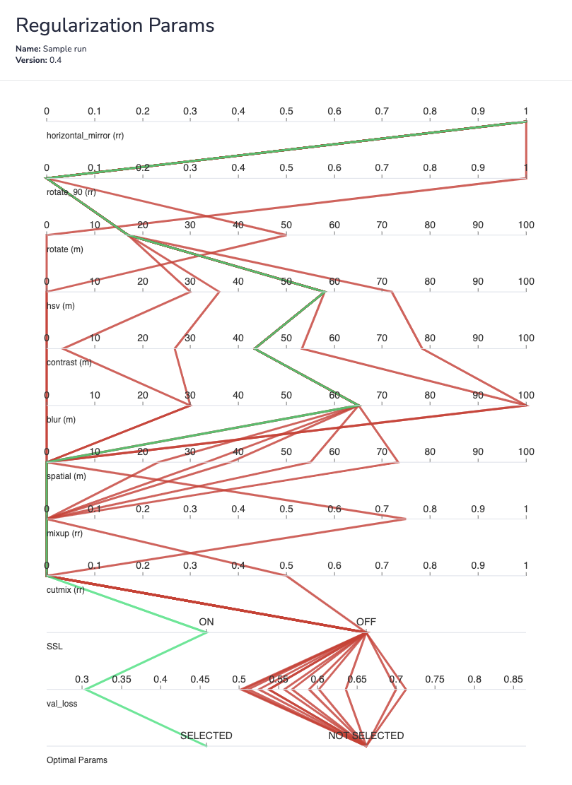
There are 3 categories of values in the parallel coordinates plot. The Category is indicated via a suffix:
Magnitude “(m)”: Each value on the axis shows the magnitude of the technique.
Replacement Rate “(rr)”: Each value on the axis shows the replacement rate of the technique. A replacement rate specifies the percentage of the dataset the technique is applied on. i.e. 0.5 means the technique was applied on 50% of the examples in the dataset, and the other 50% were not impacted by this technique.
Ratio “(r)”: Each value on the axis represents the ratio used for the technique. This is contextual. For example, a synthetic data blending with a ratio of 0.1 means the amount of synthetic data blended into the dataset was equal to 10% of the original dataset size. A dataset with cardinality of 100k examples, would have 10k synthetic data examples blended, and the total dataset cardinality, including original and added synthetic data, is 110k.
Model Improvement on Loss
This chart plots the impact of each technique on validation loss. By visualizing the impact of techniques individually on validation loss, developers can understand which techniques applied by Masterful most increased their model performance. This gives insight into the quality of the dataset as well as the selection of model architecture.
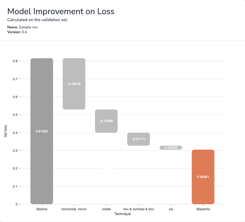
This plot only visualizes techniques that yield positive impact on validation loss.
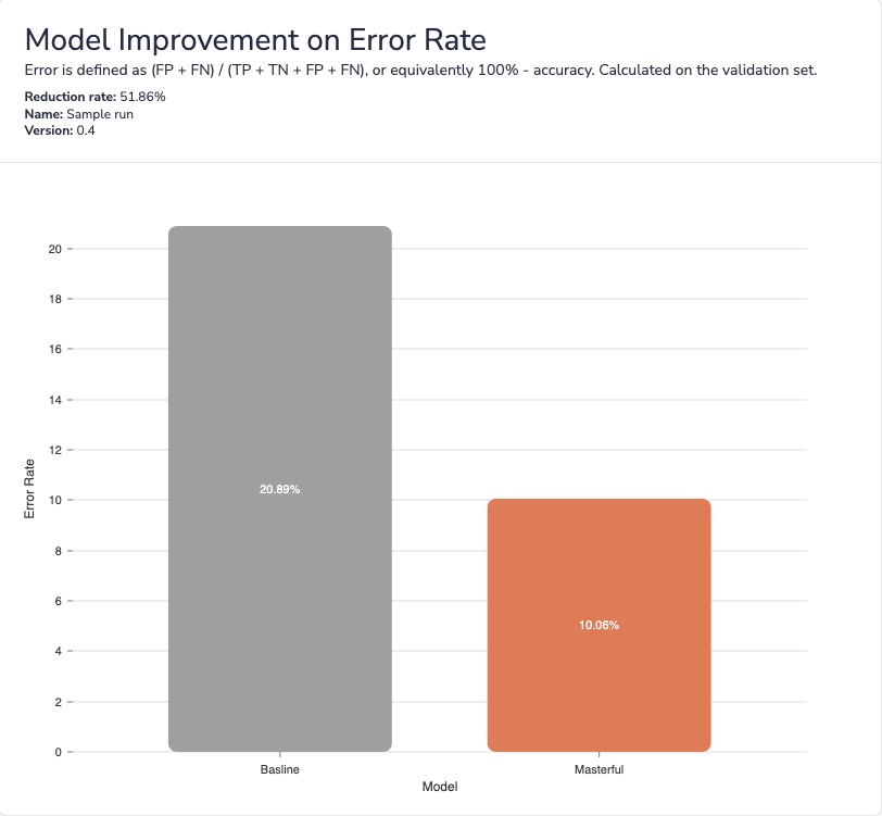
Model Improvement on Error Rate
This chart plots the error rate of both the baseline model and the model trained with Masterful. The chart displays the reduction of the error rate as a result of training with Masterful. This gives insight into some of the performance gains won by training with Masterful’s training platform.
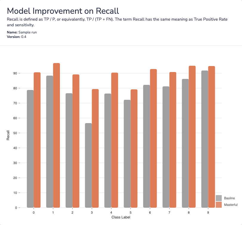
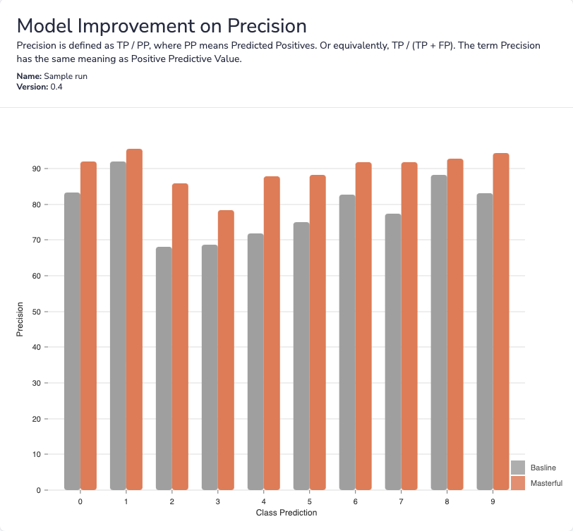
Model Improvement on Recall By Label and Precision by Prediction
For classification tasks, this chart plots the model’s recall and precision, broken out by groundtruth label and prediction accordingly.
The topline model accuracy does not tell the full story about a model’s performance. By understanding model performance on a per-label and per-prediction basis, developers are better equipped to address specific weak points of their model. For example, this could include more targeted data collection for specific problem classes.
Docs
This page links to the Masterful public API documentation available online. The versions of Masterful training platform and the GUI are tightly coupled, thus the GUI will always point to the documentation of the API version that is associated with it. Users should always update both packages when new versions are released to secure compatability.